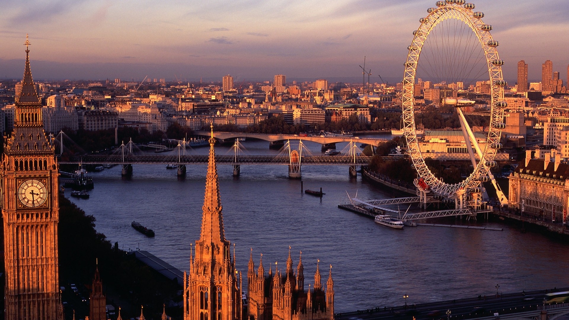
Image
The v-img component is packed with features to support rich media. Combined with the vuetify-loader, you can add dynamic progressive images to provide a better user experience.
Basic
v-img component is used to display a responsive image with lazy-load and placeholder.
Cover
If the provided aspect ratio doesn’t match that of the actual image, the default behavior is to fill as much space as possible without cropping. To fill the entire available space use the cover prop.
Height
v-img will automatically grow to the size of its src, preserving the correct aspect ratio. You can limit this with the height and max-height props.
Placeholder
v-img has a special placeholder slot for placeholder to display while image’s loading. Note: the example below has bad src which won’t load for you to see placeholder.

Error
v-img has an error slot that can be used to display alternative content if an error occurs while loading your source image. A common use for this slot is to load a fallback image if your original image is not available.
Grid
You can use v-img to make, for example, a picture gallery.


Complex Grid Layout
Build a more complex picture gallery layout using flex-box classes.
CONTENTS
Introduction
Basic
Cover
Height
Placeholder
Error
Grid